Jelly Bun
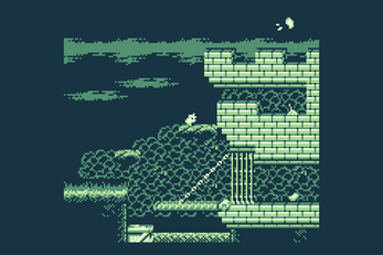
Made in around one month to learn GBstudio you play as a little jelly bean bun hunting down a tasty snack of beans in this cute but challenging classic style platformer.
Try to get a 3-star rank on both demo zones, look hard enough and you might find a hidden gem to make it easier!
Try the demo out on your Analogue pocket or on a real DMG gameboy with a compatible flash cart!
| Status | In development |
| Platforms | HTML5 |
| Rating | Rated 4.9 out of 5 stars (9 total ratings) |
| Author | Ryan Marcham |
| Genre | Platformer |
| Tags | 2D, analogue-pocket, Cute, dmg, game-boy, Game Boy, Game Boy ROM, gbstudio, Retro |
Download
Download
JellyBunDemo_DMG_Pocket.zip 114 kB
Install instructions
This download includes a gameboy compatible rom and an Analogue Pocket compatible file.


Comments
Log in with itch.io to leave a comment.
This is extremely smooth and satisfying to play. Everything is quite self-explanatory and challenging without being pixel-perfect, at least in the early stages I've gotten to. Jelly Bun mascot is a precious little sprite, I am extremely fond.
Hard to believe this game represents your initial learning process! Well done, and thank you for making it.
I can't figure out how to get three stars on the levels.
It's based on total time and the bonus of finding the gem which is semi hidden on some of the stages, if you see some twinkling stars appear while on a stage it may have unlocked something if you backtrack a bit.
Really fun, I added it to my platform collection! The animation, music and details really make it shine. Congratulations!
omg this is adorable. thats all i gotta say. not much to critique on here tbh. extremely polished, great music, great graphics, great physics, the only thing that annoyed me was the hitboxes on some of the platforms. seemed to end a bit early or in the case of the spikes, be a bit too large. to be completely honest though, i enjoyed my time with this. will be adding it to my everdrive. thanks!
thank you! I tried to be as forgiving as possible with hit sizes but some of them are just due to the square minimum sizes an actor box in GBstudio can be, but I have ideas for ways around that in the future.
im currently working on a game too, and i love the little bunny sprite!
my game has a bunny character in it too but i think it would be neat to have a little cameo of the jellybun in my game if you're ok with that?
No problem at all!
:D thanks!
polished and fun. I got confused by two things: thought you could climb the chains and at first thought the big bean was showing my progress in eating all the beans
I can see where the big bean might be misleading, I nearly took the timer mechanic out (at one point it was a clock) but I might look into it to see if another method might work.
Great game! Are there plans for a complete version?
Hopefully! can't give any estimates as I do not know when i'll have time yet.
I love it! Cute and juuuust difficult enough.
this game is soo good! like the animations and the music
Great job! The music and animations are really nice. Looking forward to a full release.
really cute and fun, its like platformer puzzles, really addictive gameplay.
Excellent work. The attention given to the various animations has set this above the average platformer made with GBS. The level design and progression is well considered and the ranking system offers replay-abitity which I really appreciate.
Are you happy for me to detail my play through in order for me to give you some feedback?
Please feel free! it will be interesting to hear as i've replayed my own work for weeks, I could do with hearing from another perspective.
I can record a let's play on my YouTube channel to do it properly within a couple of weeks if that suits?
Or I can just list it all here? what ever you prefer.
I have been playing through this again and thought I would add my feedback. Didn't hear back from you but I'll just tell you what I think.
- Level design in quite nice, no frustrating learning curve, easy to understand what must be done, no particularly frustrating jumps to be found - so it ends up being quite fun to move around through the levels.
- Since you have chosen to use the dark tones, this will work well on emulator but on the DMG, it is super hard to see what's happening when the screen scrolls. Some platforms are hard to see because there isn't high contrast against the dark black background. If you were to implement some white highlights on the top of the one way platforms (like your boxes), that would help readability dramatically. I find its always best to not use a black background if you want to design for the DMG. Having said that, I have seen some GB games use the "night time" scene really well (Ninja Gaiden Shadow is the best example) but even then, they stylistically imply its night time rather than use the black tone everywhere. GBC development is best for more moody stuff in this regard because it doesn't affect readability on the GBC screen so much.
- Inversely, there are some chains with a white highlight that are background elements, they are more prominent visually than the platforms so there is also readability issues with that. I recently wrote a 2 part article on readability if you want to check it out (https://gbstudiocentral.com/tips/dwf-chapter-6-readability-part-1/)
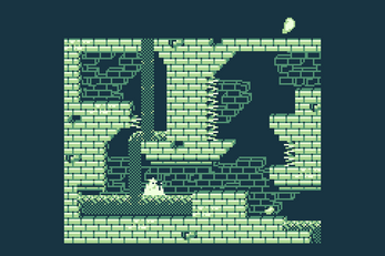
- Finally, the hit boxes are quite frustrating, particularly the side-ways facing spikes. I assume this game was developed in GBS2b5 so therefore, you can't change the hit boxes. If its migrated to GBS3.0 then you would have much more control - but that is no easy task! I have tried that myself with my own projects and it can be quite the task. If you are not doing that then the jumping hit box could be fixed slightly by moving jelly buns jumping animation over a pixel or two in the PNG - I have been hit so many times with the side spikes when its clear that jelly bun never touched the spike - so its really hard to make that second side spike jump (after the waterfall and body of water) I think the player drop off would be highest here. I stopped playing here the first time I played due to frustration.
- Otherwise, I reckon all the nice little touches in the game are just wonderful. You definitely have a great eye for polishing the enjoyment factor - with the sparkly effects, bubbles, "chomp", stuff like that. I wouldn't expect you to update this game as you are likely working on some other no doubt really nice game at this point. But I wanted to share my thoughts with you so you have some useful feedback to take into your future projects. Good luck with GB Studio development and great work!
Thank you for the feedback! sorry I did not see this for such a long time. I agree with the spike hitbox issues but there was little I could do as I was using trigger zones so limited to their default sizes, it was a fun first attempt with gbstudio and all the feedback is super nice of you so thank you again.
You're welcome :) it's an amazing first attempt then!